Sunday, April 24, 2011

Blog Post 26

Brainstorms! (In an effort to expand, improve, add complexity, and push your final projects further, please pick 10 of the following to discuss.)
  1. What is the “opposite” of your final project? How can you rework your project to include the “opposite”?
    1. If I were to create something opposite of my project I would create a colorless image. Maybe one with neutral tones with no real focal point.
  2. What is a consistent theme/visual element in your project? What would be the opposite of this? How can you implement that into your project? 
    • A constant theme in my project is the emphasis on the color red. while the photos are all in color the brightest of all remains the object that is red. I tried to keep that the focal point of all the images. If I was to take the opposite I might change the color in the focal point of change all the photos to gray scale.  
  3. At the deepest core, describe why you like this project. Dig deep!
    • I think I just really enjoy working with color. I think color really effects the way you view a photo or peice of art. It can inflict emotion as well as interest in a piece or art.
  4. Expand your project. If time, money, materials, etc would not affect you, how would you expand your project?
    • It would be interesting to tour the country or the world. If money was no option as well as time it would be really interesting to create pictures in different scenes worldwide.
  5. Contract your project. What would it boil down to if squeezed and contracted to its simplest form?
    • It could be a simple project of photographing items that are red keeping the background blank. But I like the concept of feeling the need to focus in on that bright color with other minor colors surrounding it.
  6. Look at one of your images. Redesign it entirely.
    • If i were to redesign one of my images I may take pictures of the toothbrush in action. It could be interesting to see the color red attatched to someones mouth.
  7. What would your project look like 100 years ago? What would your project look like 100 years in the future?My project would have been non existant a 100 years ago, color photography was not yet created. I could have painted the red color in however it wouldnt be the same effect overall. It's hard to say where photography will take us in the future. But I image that the color that I emphasized could be created in a 3d way or have the technology to pop better.
  1. Remove something from your project. How does it change?
    • If I were to make this project black and white it would completely change the concept and overall success of the project. I think a lot of what makes this project unique is the emotion that color inflicts on you. I think it would lose a lot if it were a softer toned image.
  2. Persuade the reader that your project works well and is the most amazing project you have ever completed.
    • I liked the freedom of this project. I thought it would be hard to find red objects amidt neutral tones, but I found in comparison to most colors and tones red tends to stick out without me trying. I was also lucky enought to come into contact situations that were worth photographing (easter egg hunt with my family) I am pleased as to how well these photos are turning out.
  3. How would you convert your project into a narrative? How would you remove any narrative from your project? 
    • I took a lot of photos of my cousin in his Easter egg hunt. Those photos could be arranged to tell a story of the chase and the adventure in searching for those eggs. though it would be a simple non complex story i think it could relate to many people who have experienced something similar during childhood.
  4. Name an artist/photographer/designer/videographer who would love your project. Why?
    • My project plays a lot with the value of color in art. I think the director of the film "Sin City" would appreciate this type of photography. This film is shot completely in black and white beside red objects. In this same way my project brings out a certain color (red) to the eye of the viewer and emphasizes that object.

Tuesday, April 19, 2011

Assignment 5


Smokey the Bear
Like I said in critique, I wish this cigarette was lite or at least slightly burnt. I was happy with how the coloring turned out. In the original it was a more neutral colored bear, but I upped the contrast and darkened some areas to bring out the  bear on the neutral background


Sequin Ocean

I really played with the colors in this image. Originally this photo was much bigger and was focused on a bright red sequin fabric. After cropping and editing the colors it began to look less like fabric and more like a wave. The blue undertones also added to the ocean feeling.


Subtle Cat
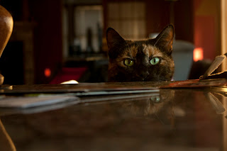
I titled the image Subtle Cat because  ironically my cat was obviously waiting to jump on the counter. We were cooking and she waited at eye level to see what we were making and hoped she would get a taste. However she is very subtle in the reflection on the counter. I think it created a nice sense of space and an interesting illusion.


Awkward Angles
I really like the angle each object has in relation to one another. The counter breaks in at an awkward angle while my dog and my mom are at a diagonal from each other. I think I want to play more with the color to make the yellow fade out a little more and the blue be a little less glossy.

Red Primary theme for final


Inspiration Photo

Sunday, April 10, 2011

You as Curator
Look through the list of recent entrants to this call for photography. 
http://pdncuratorawards.com/entries.shtml
Pretend you are curating a show and choose 7 photographers to include in your show. Describe why you would pick those particular artists and what about their work stands out to you.


Luke Nilsson

I picked this image because of its beautiful simplistic nature. I also liked the asymmetrical framing in this photo.


Mitchell 

I really like the neutral tones in this image. The simplicity of the colors really makes you look at the details in the architecture.


Christian Mushenko

I laughed out loud when I saw these photos. I love how he made super heros appear to have a normal relationship. From walking the dog to getting coffee these two are experiencing a typical day of a couple.... while wearing spandex


Samon Michael Far

I love the framing of Far's images. They are all landscape images with unposed subjects. I love the natural feeling of his photos and the black and white coloring


Steven Colin

I really liked the painting aspect of this image. Its almost surreal how this photo was taken. Was this a picture chipped away? Is it supposed to mimc a painting? Or was it photoshoped in? This is just an interesting photo to look at. 


Ali Richards

I looked at six of Richard's images and most of them were very desolate and lonely feeling, however this image looked more cosy and intimate rather then lonely. The lights make the house feel cosy


Janie Ross Coulter

Coulter's collection of photographs focuses on the beauty of nature. They all have a very natural rustic feeling to them. I picked this photo because of the autumn coloring reflecting off the water. I think there was a lot of subtle beauty in this image

Saturday, April 2, 2011

Blog Post # 24


A. Pick two images from any of the “constructed reality” photographers presented in class or linked on the assignment sheet. Describe how you could recreate these two images on a “smaller scale”.

B. Describe your plans for your self-proposed final project (if the plan is the same as before, paste it here again and give a bit more detail). During the final critique for Assignment #5, you will discuss/present these ideas to the class.

A.index.php.jpg

These photos are taken by Valerie Belin

I love this picture. The color palette is gorgeous along with the calm expression on her face. If I were to recreate this image I would also replicate the red lip stick with an overlay of floral. I may play with a different color palette and bold jewelry and earrings.

index.php.jpg

I would like to play with the idea of lines presented in this image. I like the three piles and the slightly awkward tension created by the stacking of the machinery. I would like to try something like this maybe with makeup or nail polish. I may play with color in my recreation of this image

B. I would like to play with texture for my self proposed project. Similar to the overlay of floral on the face I may like to create a face out of flowers. with different items recreating and making up the face. I'm not sure how the whole thing will work out at this point, but I want texturized items to create something new and innovative